
Image d’illustration © TopTenPlay EN
The Power Of Gray’s Neutral Foundation And Its Design Challenges
Gray commands respect in interior design circles for good reason. This sophisticated neutral offers unparalleled versatility as a backdrop color, creating endless possibilities for creative expression. Yet beneath its elegant facade lies a decorating challenge that catches even experienced designers off guard.
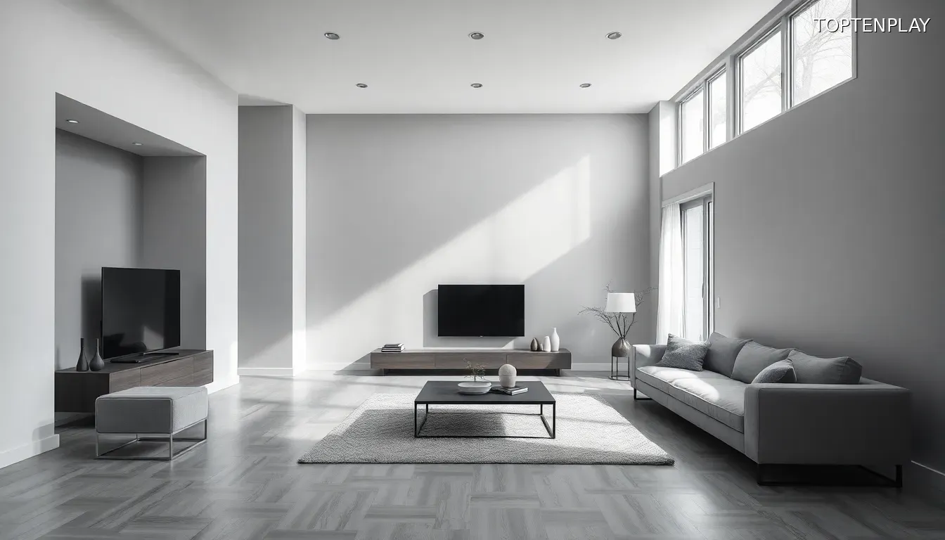
The reality many homeowners discover too late is that gray can be somewhat stark if not done properly. What begins as an ambitious vision of understated luxury often transforms into something far less appealing: a sterile environment that feels more clinical than comfortable. This common pitfall stems from gray’s inherent nature as a cool, restrained color that demands thoughtful intervention to reach its full potential.
Without strategic contrast, gray spaces risk falling into the dreaded territory of blandness. The color’s neutral properties, while offering flexibility, can also create rooms that lack personality and warmth. This isn’t a flaw in gray itself, but rather a consequence of treating it as a complete solution rather than a foundation requiring enhancement.
The key lies in understanding that gray’s true power emerges not in isolation, but through deliberate pairing strategies. Smart decorators recognize that this sophisticated neutral serves as the perfect canvas for bolder interventions. The question isn’t whether gray works in interior design—it’s how to unlock its capacity for creating genuinely luxurious, inviting spaces that captivate rather than simply exist.
The solution requires introducing elements that can instantly transform these potentially sterile environments into dynamic, personality-rich rooms.
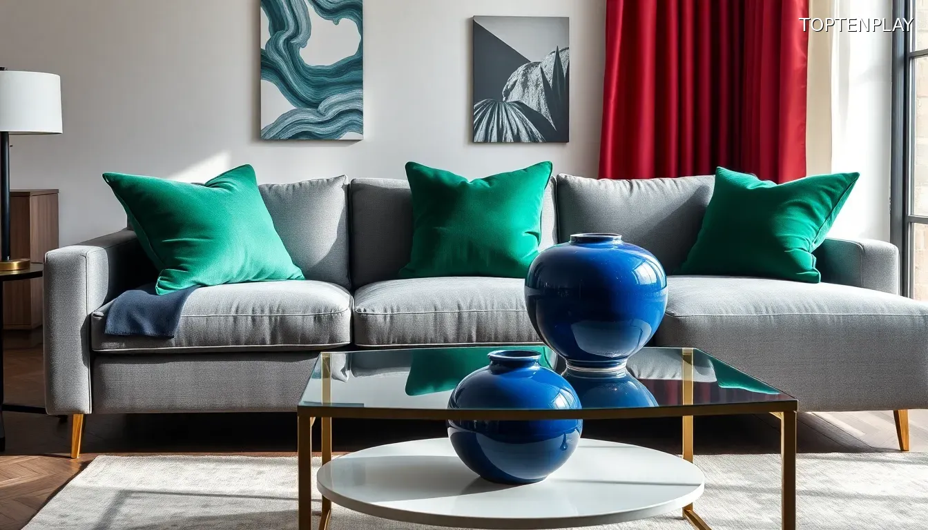
Image d’illustration © TopTenPlay EN
Jewel Tones As The Ultimate Gray Companion: The Science Of Color Pairing
Those transformative elements that instantly elevate gray from stark to stunning have a name: jewel tones. This sophisticated color strategy harnesses the science of contrast to create dimension and drama that gray spaces desperately need.
The secret lies in understanding gray’s hidden complexity. Every shade contains subtle undertones that, when properly identified, reveal the perfect jewel-toned companion. Emerald green pairs beautifully with true or cool gray because these grays contain natural green undertones, creating an organic harmony that feels both luxurious and cohesive.
For grays with blue undertones, sapphire jewel tones deliver that same magnetic effect. The saturated depth of this rich blue creates visual tension against gray’s restraint while maintaining sophisticated balance. Meanwhile, warmer grays—those containing pink or brown undertones—find their perfect match in ruby shades that add warmth without overwhelming the palette’s refined nature.
The magic amplifies through texture selection. A rich, saturated velvet green furnishing doesn’t just introduce color; it pulls through both the gray foundation and jewel accent while adding tactile luxury through fabric choice. This layered approach transforms what could be a simple color pairing into a multi-sensory design experience.
By pairing these saturated pops of color with gray backdrops, spaces gain bold, dramatic finishes that inject personality and warmth into previously cool palettes. The beauty of this approach lies in its efficiency—minimal jewel-toned additions create maximum visual impact, proving that strategic color placement outperforms overwhelming decoration every time.
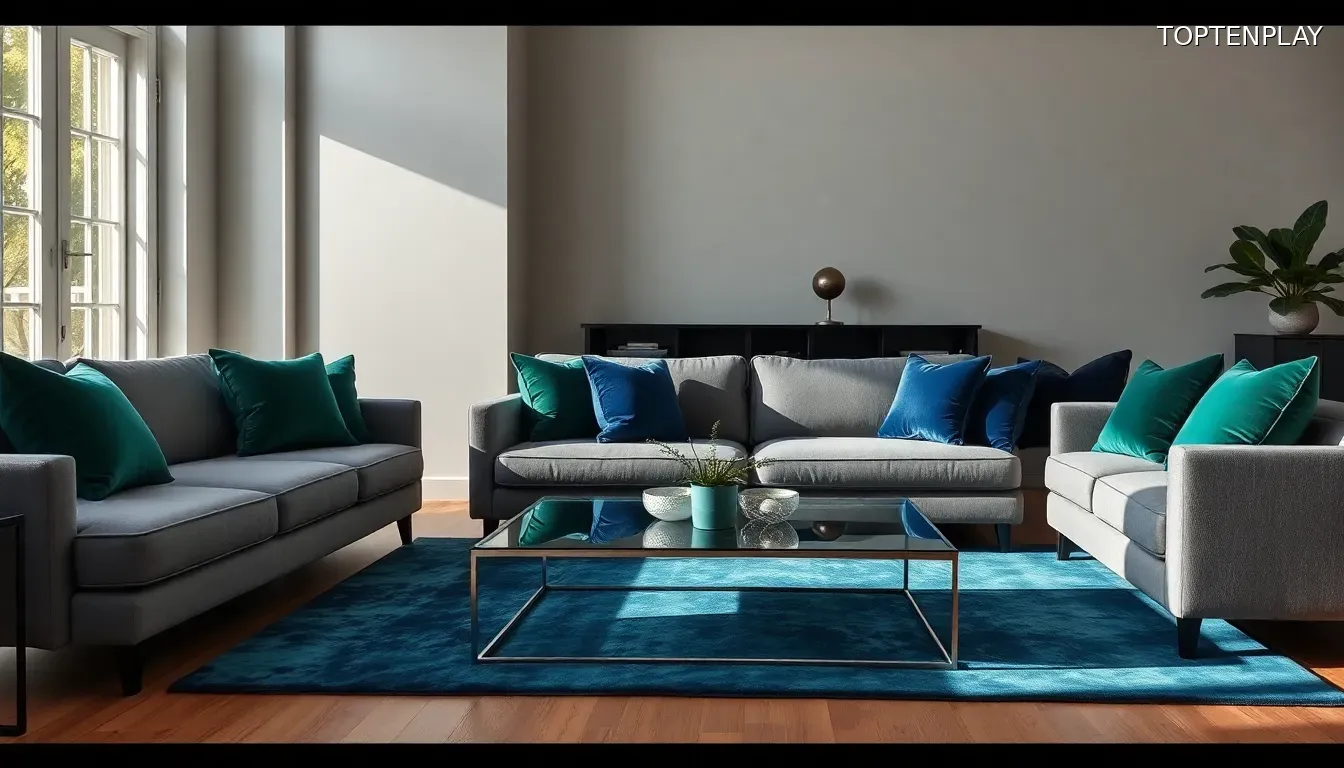
Image d’illustration © TopTenPlay EN
Strategic Implementation: From Minimalist Touches To Bold Statements
Understanding the theory behind jewel tone pairings means nothing without knowing how to execute them effectively. The beauty of this design strategy lies in its adaptability to any comfort level or aesthetic preference.
For those embracing minimalist sensibilities, restraint becomes your greatest asset. Simply adding one or two pops of jewel tone accents delivers more than enough impact to pull through that inviting atmosphere gray spaces crave. This approach might manifest as a single statement furniture piece paired with a complementary rug, or strategic window treatments combined with coordinating throw pillows.
The key lies in thoughtful placement rather than quantity. Spacing jewel-toned elements across the room creates visual flow without overwhelming gray’s sophisticated foundation. A throw pillow and wall hanging combination offers an accessible entry point for hesitant decorators, while furniture and textile pairings provide more substantial transformation for confident spaces.
Every shade of gray contains different undertones, making careful selection crucial to successful implementation. Cool grays demand different jewel companions than their warm counterparts, and understanding these relationships prevents costly color clashes.
This strategic restraint proves that impactful design doesn’t require dramatic overhauls. Two well-chosen jewel-toned additions can transform sterile gray environments into luxurious, personality-rich spaces that feel both sophisticated and welcoming. The minimalist approach demonstrates that sometimes the most powerful design statements come from knowing exactly when enough becomes perfect.
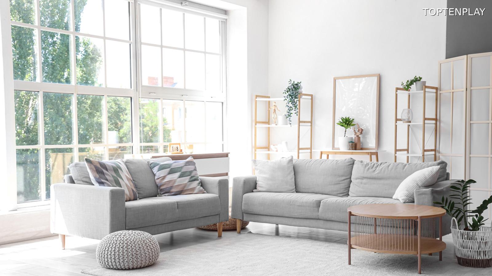
Image d’illustration © TopTenPlay EN
Advanced Layering Techniques For Maximum Visual Impact
While restraint delivers elegant results, bolder decorators can push these principles further through sophisticated layering strategies. For those embracing eclectic sensibilities, the same gray foundation supports dramatically richer jewel tone applications without sacrificing sophistication.
This advanced approach begins with strategic base selection. Use gray as your foundational color for walls and floors, creating a neutral canvas that anchors even the most vibrant jewel combinations. This grounding prevents eclectic spaces from feeling chaotic while allowing multiple bold shades to coexist harmoniously.
Gray wood flooring presents particular opportunities for layering innovation. Rather than replacing dated gray floors, cover them with rugs featuring rich jewel tones that introduce color while adding textural depth. This technique layers both visual interest and practical comfort into spaces that might otherwise feel cold.
For maximum impact, large furniture pieces become your jewel-toned anchors. A sapphire velvet sofa or emerald accent chair commands attention while maintaining the room’s sophisticated foundation. These statement pieces prove more effective than scattered smaller accents, creating focal points that organize the entire space around their dramatic presence.
Existing gray upholstery transforms through strategic textile layering. Jewel-hued throws draped across gray sofas introduce warmth and personality without permanent commitment, while multiple coordinating shades create rich, complex color stories that evolve with changing light throughout the day.
This layered approach demonstrates that eclectic doesn’t mean overwhelming—it means intentional abundance guided by gray’s stabilizing influence.